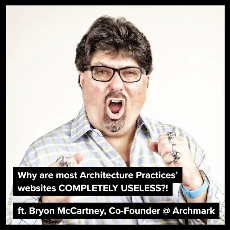
Why are most Architecture Practices’ websites COMPLETELY USELESS!
Summary
If you've ever been job seeking, you've probably looked at over a hundred Architecture Practice's online which includes scrolling through their websites.If you've ever been job seeking, you've probably looked at over a hundred Architecture Practice's online which includes scrolling through their websites.
Some are an absolute job, with beautiful images and a great user interface which glides you from one project to another with a gentle touch.
The vast majority of Architecture Practices' websites on the other hand deserve to be taken to the Web-design JAIL for serial offences such as slow-loading websites, unclear menu structure, absolutely empty Archi-Jargon, HUGE images or even hidden contact details.
These are a few, there are a lot of others. I'm joined from across the pond, Bryon McCartney who is co-founder of ArchMark
Together we will discuss:
- How branding and marketing makes firms more resilient in a recession
- Blogging to build your reputation and reach and perhaps most importantly of all what his team learned from evaluating more than 600 architecture firm websites.
📐 The Architecture Social is an online platform packed with content to help you find new jobs, stand out from the crowd and take your career in Architecture to the next level
💻 Find out more at https://www.architecturesocial.com
Creators and Guests

Host
Stephen Drew
Hello! I’m Stephen Drew, Founder of the Architecture Social—an online community and resource hub dedicated to helping professionals in Architecture, Design, Development, and Real Estate advance their careers. I’m here to connect you with insights, tools, and opportunities that lead to meaningful growth, whether you’re just starting out or ready to take that next big step.
